Greetings! I'm Aneesh Sreedharan, CEO of 2Hats Logic Solutions. At 2Hats Logic Solutions, we are dedicated to providing technical expertise and resolving your concerns in the world of technology. Our blog page serves as a resource where we share insights and experiences, offering valuable perspectives on your queries.

Most developers are well used to Bootstrap and it’s grid system to develop responsive websites quite fast and easy. But when they come to Shopware they are challenged with PocketGrid in the default theme, which is very light compared to Bootstrap but doesn’t really have the grid-like the workflow of Bootstrap. We believe the grid system is quite convenient so we developed something simple which helps Shopware theme developers to code easily in a style similar to Bootstrap. We still keep the lightweight PocketGrid and do not use Bootstrap libraries for they are not as light as PocketGrid. Let’s see how this is done so you can adopt this style in your agency for Shopware theme development.
How to create rows and columns using PocketGrid as it is?
Below is an illustration of how we can create rows and columns. Class block-group is for a row like a Bootstrap row and b1, b2 etc are columns inside that row.
| 1 2 3 4 5 6 7 8 9 10 11 12 | <div class="block-group"> <div class="b1 block">b1</div> <div class="b2 block">b2</div> <div class="b3 block">b3</div> <div class="b4 block">b4</div> <div class="b5 block">b5</div> <div class="b6 block">b6</div> <div class="b7 block">b7</div> <div class="b8 block">b8</div> <div class="b9 block">b9</div> <div class="b10 block">b10</div> </div> |
| 1 2 3 | .b1, .b2, .b3 { width: 50%; } .b4, .b5, .b6, .b7 { width: 25%; } .b8, .b9, .b10 { width: 20%; } |
The output will be like this:
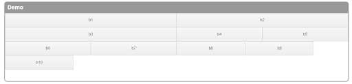
So How does this grid system work?
- b1 + b2 = 50% + 50% = 100%, so b3 goes to a new line.
- b3 + b4 + b5 = 50% + 25% + 25% = 100%, so b6 goes to a new line.
- b6 + b7 + b8 + b9 = 25% + 25% + 20% + 20% = 90%, but b10 has a width of 20%, so the total would be greater than 100%. Thus b10 goes to a new line!
Little messed up, right? Let’s see how we can make this easier like Bootstrap.
How can we modify PocketGrid like bootstrap column grid using a LESS mixin?
Things we noticed from the above example are:
- each block has a block class
- a block-group wraps all these blocks
- blocks are stacked one below other by default with width: 100%
Things to achieve using mixin:
- We don’t want to add class .block-group for each row every time, it’s better to have these extended with the classes we use
- We don’t’ want to add a .block class for each column, This also we need to apply dynamically.
- We don’t want to use % anymore, instead, we use it like Bootstrap 12 column grid system.
Below is a mixin we created to achieve this.
| 1 2 3 4 5 6 7 8 9 10 11 12 13 14 15 16 17 18 19 20 21 22 23 24 25 26 27 28 29 30 31 32 33 34 35 36 37 38 39 40 41 42 43 44 45 46 47 | // Variables @grid-columns: 12; //Loop Mixin .for(@i, @n) { .-each(@i) } .for(@n) when (isnumber(@n)) { .for(1, @n) } .for(@i, @n) when not (@i = @n) { .for((@i + (@n - @i) / abs(@n - @i)), @n); } .for(@array) when (default()) { .for-impl_(length(@array)) } .for-impl_(@i) when (@i > 1) { .for-impl_((@i - 1)) } .for-impl_(@i) when (@i > 0) { .-each(extract(@array, @i)) } // makeGrid Mixin .makeGrid(@child) { &:extend(.block-group all); // loop child .for(@child); .-each(@value) { @class: extract(@value, 1); @column: extract(@value, 2); // create child div .@{class} { &:extend(.block all); @media (min-width: 480px) { width: percentage((@column / @grid-columns)); } } } } |
Then import our mixin to less file:
In the below example let’s consider we need to build a header row with 3 columns.
| 1 2 3 4 5 6 7 8 9 | @import "mixin-name"; // Style .header{ .makeGrid( @child: logo 2, navigation 8, search 2; ); } <span id="mce_marker" data-mce-type="bookmark" data-mce-fragment="1"></span> |
| 1 2 3 4 5 | <div class="header"> <div class="logo"></div> <div class="navigation"></div> <div class="search"></div> </div> |
Mixin overview:
- Automatic extension of parent (.header) with .block-group
- Looping all child and extending child with .block
- The child must be a class without a dot(.)
Eg: logo
- We can assign grid count with child variable after adding a space
Eg: @child: logo 2;
- Width is applied only from 480px so we can keep column width 100% width in mobile view.
Extend mixin to next level
We can add more options to this mixing for making its next level. We are not explaining how to do it in detail here. But the things we can achieve are like below:
- Responsive breakpoints for different screen widths. Eg:
12345678.makeGrid(@child: logo 2, navigation 8, search 2;@GridXS: logo 12, navigation 12, search 12;@GridSM: logo 4, navigation 6, search 2;@GridMD: logo 2, navigation 8, search 2;@GridLG: logo 2, navigation 8, search 2;@GridXL: logo 2, navigation 8, search 2;); - Let’s say we need to include another column in the footer – we can create a child without adding .block-group and also without MakeGrid Eg:
1234.makeChild(@class: search;@column: 4;); - Can manage margin/padding from mixin for all the children or to individual child, Eg:
1234567.makeGrid(@child: logo 2;@padding: 0;@margin: 0;@childMargin: 0;@childPadding: 0;);
You can contact us for any Shopware Development assistance and also for setting this up in your organization.
Compiled CSS from our example
| 1 2 3 4 5 6 7 8 9 10 11 12 13 14 15 16 17 18 19 20 21 22 23 24 25 26 27 28 29 30 31 32 33 34 35 36 37 38 39 40 41 42 43 44 45 46 47 48 49 50 51 52 53 54 55 56 57 58 59 60 61 62 63 64 65 66 67 68 69 70 71 72 73 74 75 76 77 78 79 80 81 | .block-group, .block, .block-group:after, .block:after, .block-group:before, .block:before, .header, .header:after, .header:before, .header .logo, .header .logo:after, .header .logo:before, .header .navigation, .header .navigation:after, .header .navigation:before, .header .search, .header .search:after, .header .search:before { -webkit-box-sizing: border-box; -moz-box-sizing: border-box; box-sizing: border-box; } .block-group, .header { *zoom: 1; } .block-group:before, .block-group:after, .header:before, .header:after { display: table; content: ""; line-height: 0; } .block-group:after, .header:after { clear: both; } .block-group, .header { list-style-type: none; padding: 0; margin: 0; } .block-group>.block-group, .header>.header { clear: none; float: left; margin: 0 !important; } .block, .header .logo, .header .navigation, .header .search { float: left; width: 100%; } @media (min-width: 480px) { .header .logo { width: 16.66666667%; } } @media (min-width: 480px) { .header .navigation { width: 66.66666667%; } } @media (min-width: 480px) { .header .search { width: 16.66666667%; } } |


Related Articles